
Design Codex
I’ve created a clear and user-friendly guide featuring essential design laws and principles for you to learn and apply in your work. As the field of design evolves, this codex will grow with it, regularly updated with new insights and improvements to remain relevant and practical.
Current number of laws and principles: 19

Jakob's Law
Users' expectations are shaped by their experience with other sites.
Miller’s Law
The average person can keep about 7 (± 2) items in their working memory.

Hick’s Law
The time to make a decision increases with the number and complexity of choices.
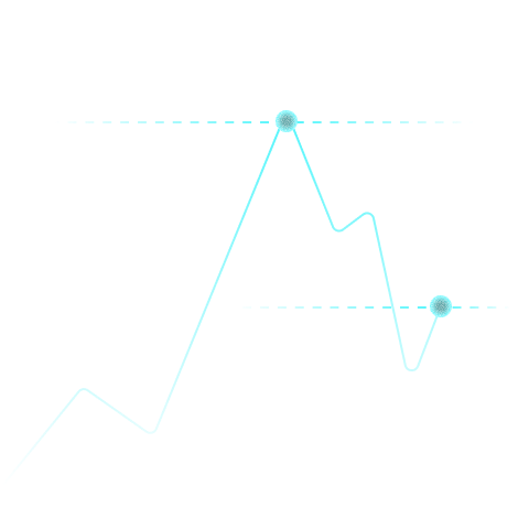
Peak-End Rule
People judge an experience by its peak and its end.
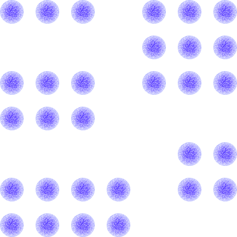
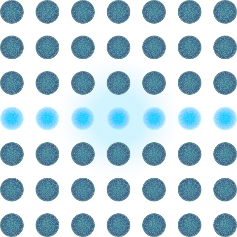
Law of Proximity
Objects that are near each other tend to be grouped together.
Understanding color codes
Colors are represented differently across mediums.

Fitts's Law
The time to acquire a target is a function of the distance to and size of the target.
Affordance Theory
The design of an object should suggest how it is to be used.

Tesler’s Law
There is a certain amount of complexity in a system which cannot be reduced.

Aesthetic-Usability Effect
Aesthetic products are perceived as easier to use.

Doherty Threshold
Productivity soars when a computer and its users interact at a pace (< 400 ms) that ensures that neither has to wait on the other.
Sunk Cost Fallacy
People hesitate to quit a strategy due to past investments, even if future benefits don't justify ongoing commitment.

Pareto Principle
Roughly 80% of the effects come from 20% of the causes.

Goal Gradient Effect
The tendency to approach a goal increases with proximity to the goal.

Parkinson’s Law
Work expands to fill the time available for its completion.
Endowed Progress Effect
A phenomenon where people are more likely to complete a goal if they have a head start.

Cost-Benefit Principle
Users weigh the cost of their action (effort) against the benefits they will receive.

Scarcity Principle
Items in short supply are perceived as more valuable.

Occam's Razor
Among competing hypotheses that predict equally well, the one with the fewest assumptions should be selected.
Jakobs's law
Users' expectations are shaped by their experience with other sites.
Meaning
Jakob's Law suggests that what people expect when they visit a website is based on their experience with other websites. When designing a website, it's important to remember that people like things to be familiar and easy to use, based on what they've seen and done on other sites.
Daily life examples
- Elevator buttons: Generally placed in a similar layout in most buildings.
- Doorknobs: They're usually at the same height and work similarly in most buildings.
- Public transport maps: They often use similar symbols and color-coding systems.
- Car steering and pedals: The arrangement is mostly the same in all cars, making it easier to drive different models.
- TV Remote Control: The power button is usually at the top right corner and not at the bottom.
Challenges and considerations
- Limits Innovation: Sticking to what's familiar might stop new and unique designs from being developed.
- Not for Everyone: Some specific user groups might prefer or need different, specialized designs.
- Changes Over Time: User expectations can change, so what's familiar today might not be in the future.
- Cultural Differences: What's familiar in one culture might not be in another.
Origin
Jakob Nielsen, a leading expert in web usability, first described this principle. His extensive research in user experience (UX) design underpins this law. It stresses the importance of designing websites that align with what users commonly experience online. Nielsen's work delves into how users' past online interactions shape their current expectations, suggesting that designers should consider these experiences to create more intuitive and efficient websites or applications.
Miller's law
The average person can keep about 7 (± 2) items in their working memory.
Meaning
Miller's Law indicates that the average human mind is capable of holding around 7 (plus or minus 2) distinct items in short-term memory. This concept is crucial for understanding the limitations of human cognition. It suggests that when information exceeds this 7-item threshold, it becomes harder for people to process and retain. This has significant implications for how information should be presented, particularly in fields like design and education.
Daily life examples
- Remembering a grocery list with around 7 items without writing it down.
- Memorizing a short list of instructions or directions given verbally.
- Remembering the names of people just introduced in a small group.
- Keeping track of the steps in a simple recipe while cooking.
- Recalling items needed for a day out, like keys, wallet, phone, etc.
Challenges and considerations
- The capacity of working memory varies among individuals.
- Memory can be influenced by familiarity with the subject matter.
- Modern research shows that grouping information (chunking) can increase memory capacity.
- Memory performance can be influenced by age and cognitive abilities.
- Different types of information (visual, auditory, etc.) may be remembered differently.
- Emotional state and stress levels can affect memory capacity.
Mathematical Representation
T = b log2(n + 1)
where T represents the decision time, n is the number of choices, and b is a constant that varies based on the task's nature.
For instance, in a scenario with 4 options, the decision time can be calculated, considering b as a factor of the task's complexity. 'b' typically varies in different contexts, reflecting how different types of choices influence decision time.
Origin
George A. Miller, in his landmark 1956 paper "The Magical Number Seven, Plus or Minus Two: Some Limits on Our Capacity for Processing Information," introduced this principle. This paper is one of the most cited in psychology, greatly influencing fields like design, communication, and education. Miller's work was based on earlier research and observations, and he synthesized these findings to propose the 7±2 rule. His analysis of the processing limits of the human brain has had lasting implications on how information is structured and presented, from educational curriculum to user interface design. His work also spurred further research into human cognitive processes, leading to a deeper understanding of memory, attention, and information processing.
Hick's law
The time to make a decision increases with the number and complexity of choices.
Meaning
Hick's Law states a simple but significant relationship: as the number and complexity of choices increase, so does the time required to make a decision. This principle highlights how an increase in options can complicate decision-making, leading to potential decision fatigue.
Daily life examples
- Choosing a route from a few well-known paths in a park.
- Selecting a meal from a short, clear menu at a diner.
- Choosing a book from a top 10 bestsellers list.
Challenges and considerations
- Hick's Law may not apply in complex or nonlinear decisions.
- In some cases, having more choices can be motivating rather than overwhelming.
- Individual differences can influence decision-making, not covered by the law.
Mathematical Representation
T = b log2(n + 1)
where T represents the decision time, n is the number of choices, and b is a constant that varies based on the task's nature.
For instance, in a scenario with 4 options, the decision time can be calculated, considering b as a factor of the task's complexity. 'b' typically varies in different contexts, reflecting how different types of choices influence decision time.
Origin
Hick's Law was developed in the 1950s by psychologist William Edmund Hick. It's rooted in understanding human thought processes. Influenced by Claude Shannon's information theory, Hick's work, along with Ray Hyman's, has been crucial in psychology, human-computer interaction, and design. Their research highlights the effect of choice quantity on decision time. It underscores the significance of having fewer, well-chosen options in different areas, from everyday choices to complex system designs. Hick's Law has evolved to become a fundamental concept in understanding how people interact with their environments and make decisions, reflecting the interplay between human cognition and the structured world around us.
Peak-End Rule
People judge an experience by its peak and its end.
Meaning
The Peak-End Rule states that people evaluate an experience based on its most intense moment (the “peak”) and how it concludes (the “end”), rather than the average of the experience as a whole. This principle is critical for designing memorable and satisfying interactions, as users will disproportionately remember the high points and the final moments.
Daily life examples
- Amusement Parks: The thrill of a roller coaster (peak) and the fireworks display at the end of the day (end) shape how visitors remember their visit.
- Dining Experiences: A standout dish during the meal (peak) and a complimentary dessert or a friendly farewell (end) leave a lasting impression.
- Customer Service Calls: Resolving the problem with exceptional support (peak) and a warm sign-off (end) determine customer satisfaction.
- Movies and TV Shows: A gripping climactic scene (peak) and a powerful conclusion (end) define the audience’s takeaway.
- Graduations or Ceremonies: The emotional highlight of receiving an award or diploma (peak) and a celebratory closing remark or performance (end) are remembered most.
Challenges and considerations
- Neglecting Consistency: Overemphasis on peaks and endings might cause neglect of the overall experience.
- Negative Peaks: A single bad moment during an otherwise positive experience can heavily influence the overall perception.
- Misaligned Peaks and Ends: An amazing peak followed by a lackluster or rushed ending may sour the memory.
- Cultural or Personal Differences: Not everyone experiences the same moments as “peak” or “end,” so perceptions can vary.
Origin
The Peak-End Rule was proposed by psychologist Daniel Kahneman, a pioneer in behavioral economics and winner of the Nobel Prize. His research, conducted alongside collaborators like Barbara Fredrickson, examined how people recall experiences and demonstrated that memory is disproportionately influenced by the most intense moments and the ending. This principle has become a cornerstone in the fields of user experience design, customer service, and event planning, highlighting the importance of creating strong peaks and satisfying conclusions to leave lasting positive impressions.
Law of Proximity
Objects that are near each other tend to be grouped together.
Meaning
The Law of Proximity is a simple idea from Gestalt psychology that says objects close to each other seem to be grouped together. This is important in how we see and arrange things visually, both in real life and in design. It means that things that are near each other look like they belong together, making it easier for us to understand and organize what we see. This law affects everything from how we read to how we make sense of complicated pictures, showing that where things are placed in relation to each other can change how we see them.
Daily life examples
- Paragraphs in Books: Words grouped into sentences and sentences into paragraphs help us understand and organize written information.
- Furniture Arrangement: Chairs around a table are seen as a dining set because of their proximity.
- Signage in Streets: Signs close to each other at an intersection help in quick information grouping.
- Photos in Albums: Pictures placed together in an album are seen as related or part of an event.
Challenges and considerations
- In designs that are very full or complex, it might be hard to notice the Law of Proximity because there's too much going on.
- Sometimes, even if things are far apart, they might still seem related because of other cues like color or shape.
Origin
The Law of Proximity came from Gestalt psychologists in the early 20th century. It was part of a bigger idea about how people see and understand shapes and patterns. Gestalt psychology was a big change in how we think about seeing and understanding the world. It affected many areas, including design and psychology. The Law of Proximity, especially, showed us how important it is where things are placed in relation to each other when we look at something.
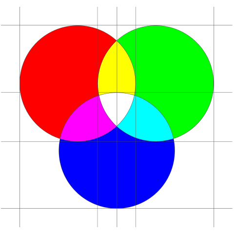
Understanding color codes
Colors are represented differently across mediums.
HEX: The Precision Code of Web Colors
Hexadecimal color codes, often referred to as HEX codes, are integral to web design and digital graphics. They employ a six-character format, or sometimes a shorter three-character version, to combine values from the red, green, and blue (RGB) spectrum to create a wide array of colors. Each pair of characters in a HEX code is associated with one of these primary colors, with the possible values ranging from 00 to FF in hexadecimal terms. This range corresponds to 0 to 255 in decimal numbers. For example, the HEX code #000000 indicates no color, which is black, while #FFFFFF represents the highest presence of all three primary colors, resulting in white. This coding system is highly valued for its accuracy and its consistency in specifying colors across various digital mediums.
The practical application of HEX codes is evident in their widespread use. They allow designers and developers to achieve precise color representation, ensuring that the colors displayed on one device are consistent with those on another. This consistency is vital in maintaining brand identity and visual coherence in digital content. Furthermore, HEX codes are simple to use and universally understood in the digital realm, making them a standard practice in web design. Their versatility and precision make HEX codes an indispensable tool in the digital artist's palette, ensuring that the envisioned design is accurately realized in the digital world.
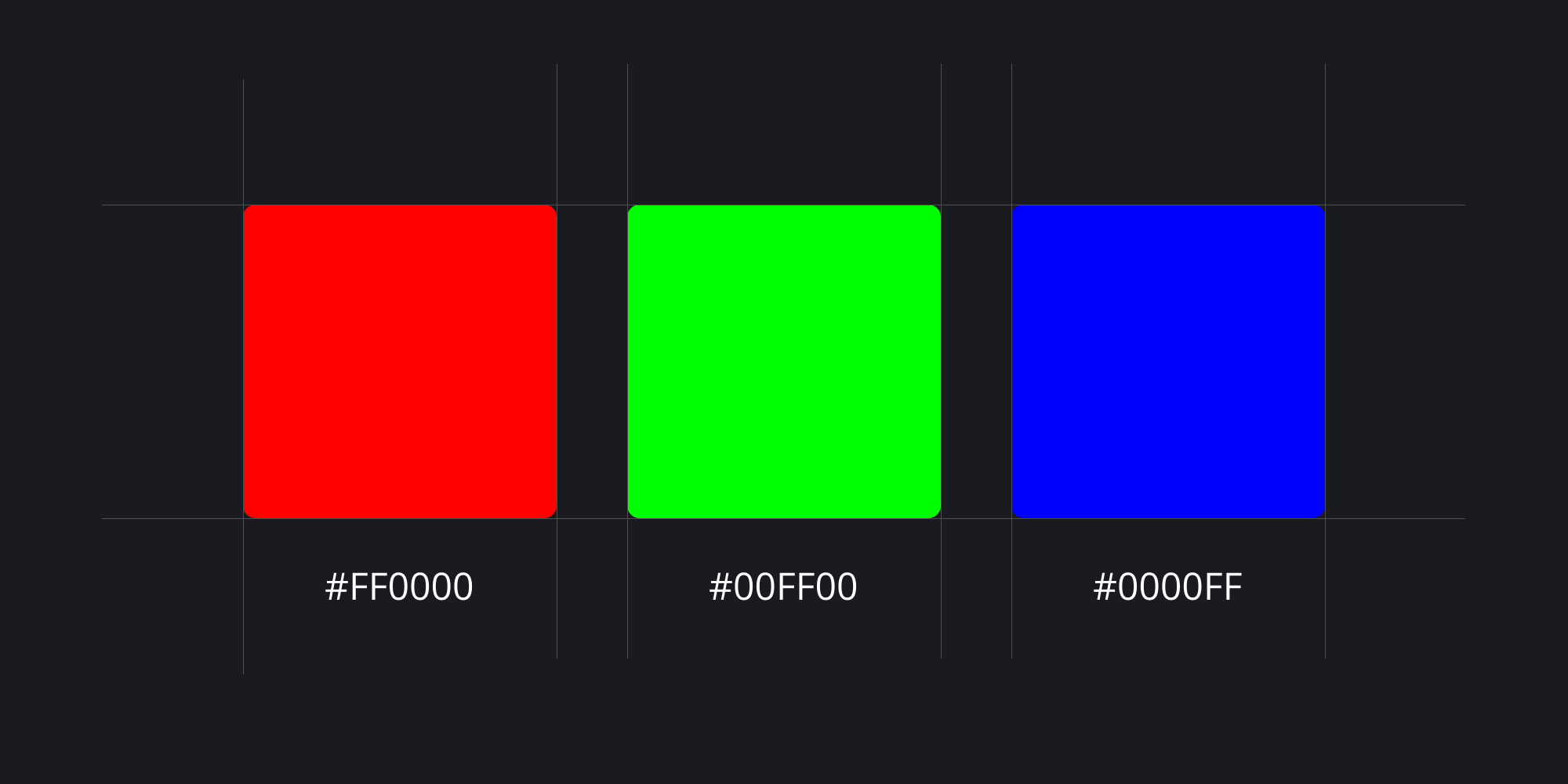
RGB: The Foundation of Digital Color Representation
RGB, standing for Red, Green, and Blue, is a foundational color model extensively utilized in electronic displays such as computer monitors, televisions, and smartphone screens. This model is based on the additive color mixing principle, where various intensities of these primary colors are combined to generate a broad spectrum of visible colors. For instance, within the RGB color space, the code RGB(255, 0, 0) signifies pure red. Here, '255' indicates the maximum intensity of the red component, while '0' is used for both the green and blue components. The versatility of this model allows for the creation of a myriad of colors by adjusting the intensity levels of each primary color, enabling it to reproduce virtually any color that the human eye can perceive.
The RGB model is specifically tailored to align with human visual perception, which discerns color through light. Its effectiveness in mimicking the way we see colors makes it an optimal choice for any device that emits light. By leveraging the RGB model, electronic displays can reproduce a wide range of colors, ensuring that the colors seen on screen are vibrant and closely match real-world colors. This adaptability and accuracy in color representation are what make the RGB color model indispensable in the realm of digital imaging and display technology. It not only enhances the user experience by providing true-to-life colors but also forms the basis of digital color interaction and design.

CMYK: The Print Industry's Color Standard
CMYK, standing for Cyan, Magenta, Yellow, and Key (black), is a color model that is primarily used in the printing industry. This model is fundamentally different from the RGB model as it is based on a subtractive color mixing principle. In the CMYK model, colors are created by partially or completely masking certain colors on a lighter background, typically white. The subtractive primary colors—cyan, magenta, and yellow—are utilized to absorb light, thereby reducing the amount of light that is reflected. The 'K' component, which usually represents black ink, is added to provide depth and detail to the image. For instance, the combination CMYK(0, 100, 100, 0) produces the color red by using maximum levels of magenta and yellow, while keeping cyan and black at zero. This method of color mixing is particularly effective in print media.
The CMYK model is crucial in the printing industry as it accurately replicates how physical inks blend to produce a wide range of colors. When inks of cyan, magenta, yellow, and black are printed onto paper, they absorb specific wavelengths of light, thereby subtracting colors from white light to create the desired hue. This process is essential for achieving the desired color output in printed materials. The CMYK color model's ability to produce a broad spectrum of colors through subtractive mixing makes it the standard for any kind of color printing. It ensures that the colors in printed materials, such as magazines, brochures, and packaging, are both vibrant and precise, closely matching the original design intent.

Pantone: The Global Language of Color
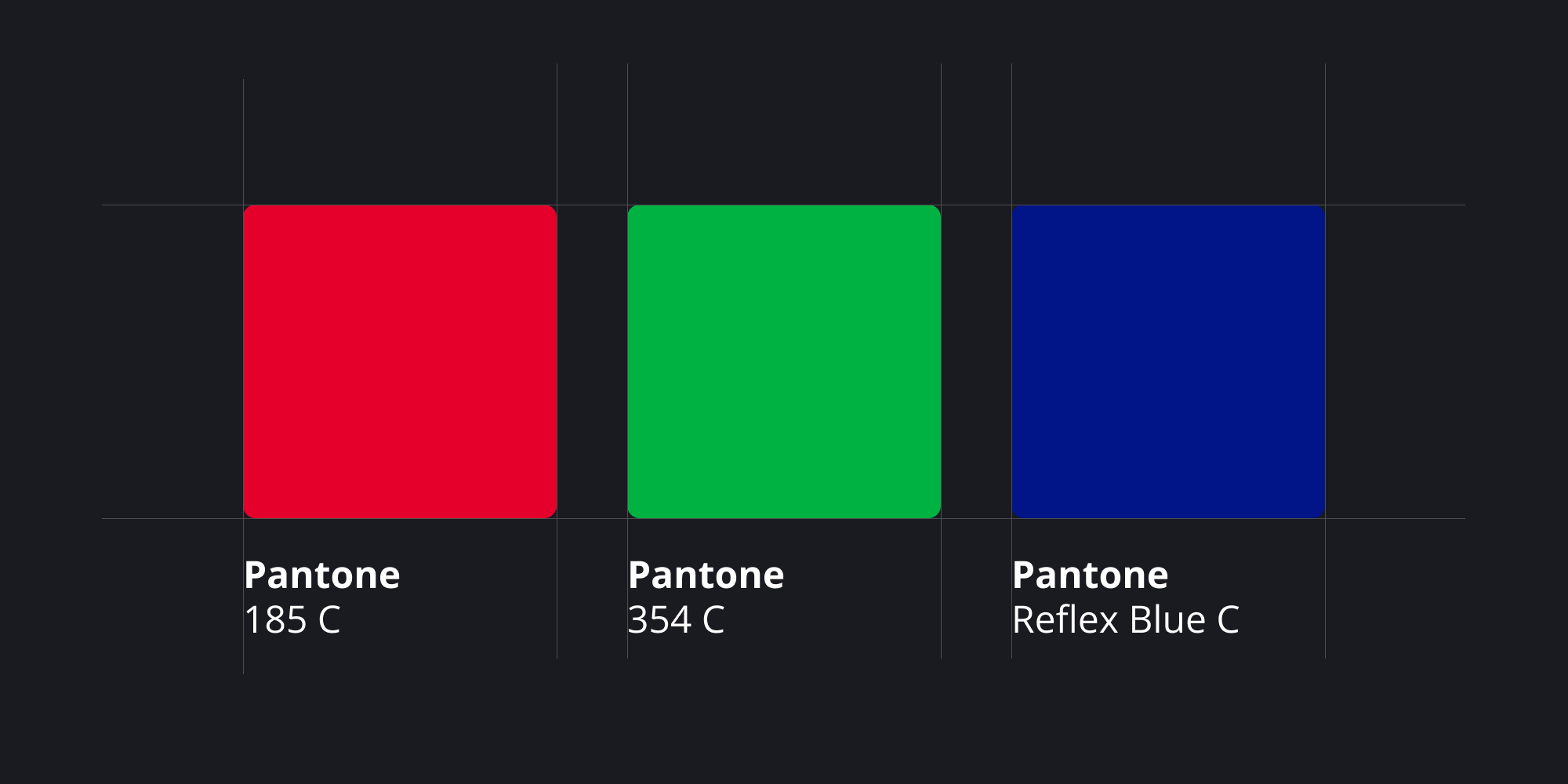
The Pantone Color System is a globally recognized standardized color reproduction system, widely used in various industries such as printing, manufacturing, and design. It functions as a universal language for color identification and communication, offering a consistent and reliable way to reference colors. Each color in the Pantone system is given a unique number and name, which ensures uniformity and precision in color reproduction across different applications and mediums. For example, 'Pantone 185 C' is a designated identifier for a specific shade of red, known and used consistently worldwide under this name. This precise system of color identification allows for exact replication and communication of colors in various contexts.
Pantone's extensive range of colors, including unique shades like metallics and fluorescents, sets it apart from standard color models like CMYK, which have limitations in reproducing such hues. This expansive palette is essential in areas like brand identity and product design, where specific and unique colors are often used to establish a brand’s visual identity. Pantone’s system plays a crucial role in ensuring color consistency, especially in complex production workflows where different materials and processes can lead to color variations. By providing a standardized color reference, Pantone helps maintain color fidelity throughout the design and production stages, ensuring that the final product matches the original design intent. This reliability and universality make the Pantone Color System an indispensable tool in the world of color management and design.
Fitts's Law
The time to acquire a target is a function of the distance to and size of the target.
Meaning
Fitts's Law is a predictive model of human movement, primarily concerning pointing actions, either physically or virtually. It states that the time required to move to a target area is a function of the ratio between the distance to the target and the target's width. In essence, targets that are smaller and further away take longer to acquire than those that are larger and closer. This principle is fundamental in human-computer interaction and greatly influences user interface design.
Daily life examples
- Reaching for a light switch in a dark room - easier when the switch is bigger and closer.
- Using a TV remote - buttons are made big enough to press without looking.
- Parking a car - simpler when the parking space is wider and closer.
- Turning a doorknob - more efficient when the knob is a comfortable size and within reach.
Challenges and considerations
- Fitts's Law might not be accurate for complex tasks that involve more than just pointing.
- The law doesn't consider how skilled a person is, or how they improve over time.
- It doesn't always apply to different types of physical movements.
Mathematical Representation
T = a + b log2(2D / W)
where T is the average time taken to complete the movement, D is the distance from the starting point to the center of the target, W is the width of the target, and a and b are constants that can be determined empirically for a particular setting.
For example, this formula can be used to calculate the time it might take to move a cursor to a button of a certain size on a computer screen, based on the distance of the cursor from the button and the size of the button.
Origin
Paul Fitts, in 1954, developed Fitts's Law. Originally, it was about modeling the action of pointing. Today, it's a key concept in ergonomics, human-computer interaction, and design. Fitts's Law helps us understand how design choices affect user efficiency and comfort. It's based on the idea that people can move more quickly to larger and closer targets. This understanding has been applied in various fields, from designing airplane cockpits to creating user-friendly software interfaces. The law has evolved over time, integrating insights from psychology, engineering, and design to remain relevant in our technology-driven world.
Affordance Theory
The design of an object should suggest how it is to be used.
Meaning
Affordance Theory highlights the importance of designing objects in a way that their intended use is immediately apparent to users. Coined by psychologist James J. Gibson, this principle emphasizes that the physical and visual properties of an object should communicate its function. In design, it helps ensure usability by leveraging intuitive understanding rather than relying on instructions.
Daily life examples
- Door Handles: A push plate signals “push,” while a handle signals “pull.”
- Light Switches: Rocker switches or dimmer knobs suggest their method of operation by their shape and movement.
- Buttons on Devices: Concave buttons invite pressing, while sliders suggest sliding actions.
- Touchscreen Icons: Icons such as a magnifying glass for “search” or a trash can for “delete” convey their function visually.
- Chairs: The flat seat and backrest clearly suggest sitting.
Challenges and considerations
- Misleading Affordances: If the design suggests an incorrect use, it can frustrate users.
- Cultural Variations: Certain visual cues may not be universally understood due to cultural differences.
- Balancing Aesthetics and Functionality: Designers might compromise usability for style, weakening the affordance.
- Complex Systems: In multi-functional objects, affordance might conflict between different uses.
Origin
James J. Gibson introduced the concept of affordances in the context of ecological psychology in the late 1970s. He described affordances as the potential actions an environment or object offers to a user. Later, Donald Norman adapted this idea to design, emphasizing its relevance to user-centered design and human-computer interaction (HCI). Norman highlighted that good design incorporates clear affordances to ensure users understand how to interact with objects and systems without confusion.
Tesler’s Law
There is a certain amount of complexity in a system which cannot be reduced.
Meaning
Tesler’s Law highlights that every system, process, or interface comes with an inherent level of complexity. This complexity cannot be entirely eliminated; it must be managed or shifted. While designers aim to simplify interfaces, some of this complexity will always exist and has to be handled by either the system or the user. The principle emphasizes the balance between simplifying user experience and preserving essential system functionality.
Daily life examples
- Microwave ovens: Some advanced features (like custom power levels) require users to read a manual, even though basic functions are straightforward.
- Tax filing software: The complexity of tax laws means the software simplifies processes but cannot eliminate all user input and decisions.
- Mobile phone settings: Advanced options (e.g., developer mode) are hidden to simplify the interface, but the complexity remains accessible for users who need it.
- Online payment forms: Security requirements (like two-factor authentication) add unavoidable steps for the user to ensure safety.
- Dishwashers: Users choose cycles based on their needs, but the complexity of water usage, heating, and cleaning is handled by the machine.
Challenges and considerations
- Shifting Burden: Simplifying the user’s experience often shifts complexity to the backend systems, requiring robust development.
- Over-simplification Risks: Reducing visible complexity can sometimes hinder advanced users or reduce functionality.
- Balancing Act: Designers must carefully choose where complexity resides—whether with the user or the system.
- Evolving Systems: As systems evolve, new complexities may arise that need rebalancing.
Origin
Larry Tesler, a pioneer in human-computer interaction, proposed this law. Tesler’s work at companies like Apple and Xerox PARC was driven by the goal of simplifying technology while respecting its inherent complexities. His law reminds designers and developers that while interfaces can be made more intuitive, the system’s underlying complexity must be thoughtfully allocated, ensuring users are not overwhelmed while maintaining essential functionality.
Aesthetic-Usability Effect
Aesthetic products are perceived as easier to use.
Meaning
The Aesthetic-Usability Effect suggests that users often perceive visually appealing designs as more user-friendly, even if the underlying functionality remains unchanged. This principle highlights the psychological impact of aesthetics on usability, emphasizing that well-designed, visually pleasing interfaces enhance user satisfaction and perceived ease of use.
Daily life examples
- Smartphones: Sleek, modern designs like those of the iPhone are perceived as easier to use due to their clean lines and minimalist interfaces.
- Cookware: Stylishly designed kitchen tools often feel more intuitive, even if they function the same as plain ones.
- Automobile Interiors: Cars with well-designed dashboards appear more user-friendly compared to cluttered ones.
- Tech Gadgets: Products like wireless headphones with smooth, minimal designs feel more intuitive.
- Apps and Websites: Apps like Instagram are perceived as easier to use because of their polished, aesthetic interfaces.
Challenges and considerations
- Overemphasis on Aesthetics: Prioritizing design over functionality can lead to usability issues.
- Cultural Variations: What is considered “aesthetic” may vary across cultures, potentially alienating certain user groups.
- False Perceptions: Users might initially prefer an attractive design but later face frustration if usability is poor.
- Cost and Complexity: Achieving high aesthetics can be resource-intensive and might not align with all project goals.
Origin
The Aesthetic-Usability Effect was introduced by researchers Masaaki Kurosu and Kaori Kashimura in 1995 through their study on ATM interfaces. They discovered that visually pleasing interfaces were rated as more usable, even when functionality was identical. This principle has since been integral in fields like user experience (UX) design, cognitive psychology, and product design. It underscores the role of emotional responses in shaping perceptions of usability, reinforcing the importance of combining beauty with practicality.
Doherty Threshold
Productivity soars when a computer and its users interact at a pace (< 400 ms) that ensures that neither has to wait on the other.
Meaning
The Doherty Threshold emphasizes that efficient interaction between users and computers leads to enhanced productivity. When the system responds within 400 milliseconds, users remain engaged and maintain their workflow without experiencing interruptions or frustration. This principle highlights the importance of creating systems where neither party—human or machine—is left idle.
Daily life examples
- Typing on a keyboard: Instant display of characters as users type increases confidence and typing speed.
- Search engine suggestions: Results or suggestions appear as soon as users begin typing, maintaining flow and reducing time spent.
- Mobile apps: Quick loading times and seamless transitions between screens ensure continued user engagement.
- Video conferencing: Minimal lag during conversations prevents delays and improves communication.
- Gaming: Responsive controls and immediate feedback make for a more immersive experience.
Challenges and considerations
- Technological limitations: Some devices or systems may not have the hardware to achieve such rapid response times.
- Complex interactions: In scenarios where computations take time (e.g., AI-based systems), maintaining the threshold may not always be feasible.
- Expectation management: As systems improve, user expectations evolve, pushing the threshold of acceptable interaction speeds.
- Accessibility: Ensuring responsiveness for users with varying internet speeds and devices is critical to universal application.
Origin
The Doherty Threshold was formulated by Walter J. Doherty and Arvind J. Thadani in the early 1980s. Their research highlighted the psychological effects of system responsiveness on user engagement. They discovered that keeping interactions under the 400ms threshold aligns with human cognitive rhythms, ensuring users remain focused and productive. This principle has since been widely adopted in design, especially in human-computer interaction and web development, to create smoother and more efficient user experiences.
Sunk Cost Fallacy
People hesitate to quit a strategy due to past investments, even if future benefits don't justify ongoing commitment.
Meaning
The Sunk Cost Fallacy is a cognitive bias that makes people to continue with an investment or project due to the substantial resources they've already committed, regardless of future costs or benefits. This fallacy overlooks the principle that past costs are irrelevant to current decisions; only future costs and benefits should be considered. It's a widespread phenomenon affecting personal decisions, business strategies, and even governmental policies, highlighting the psychological difficulty of "cutting losses."
Daily life examples
- Reading a Boring Book: You keep reading a book you don't like because you're halfway through.
- Staying in Long Lines: Waiting in a long queue, even when it's clear it will take too long, because you've already waited for a while.
- Holding onto Bad Investments: Keeping stocks that are dropping in value because you don't want to admit a loss.
- Attending Events You're Not Interested In: Going to a concert or event you no longer want to attend, just because you bought the tickets in advance.
- Staying in Relationships: Continuing a relationship that isn’t fulfilling, due to the time and emotional investment.
Challenges and considerations
- Not Always Irrational: Sometimes, sticking with a decision can be smart if there are hidden benefits or long-term goals.
- Complex Decisions: This fallacy may oversimplify decisions where emotions or social reasons are important.
- Learning and Growth: Sometimes, persisting in something can lead to unexpected learning or personal growth.
- Cultural Factors: Different cultures may view persistence and commitment differently, affecting how this fallacy is perceived.
- Future Uncertainty: The uncertainty of future outcomes can make it hard to decide whether to continue or stop an investment.
- Risk Tolerance: People's willingness to take risks can influence whether they see something as a sunk cost or a potential opportunity.
Origin
The term "sunk cost" comes from economics and refers to costs that have already been incurred and cannot be recovered. The fallacy aspect, recognizing the irrationality of letting sunk costs influence current decisions, has been discussed in behavioral economics and psychology. It's closely linked with concepts like loss aversion and commitment, studied by psychologists and economists like Daniel Kahneman and Amos Tversky, who explored how irrational biases affect economic and personal decisions.
Pareto Principle
80% of the effects come from 20% of the causes.
Meaning
The Pareto Principle, also known as the 80/20 Rule, highlights the uneven distribution of effects compared to their causes. In design and productivity, this principle suggests that a small fraction of inputs, features, or actions typically generate the majority of results or value. Recognizing this can help prioritize efforts and resources, ensuring focus on the elements that drive the most impact. It is widely applicable in business, design, and everyday problem-solving.
Daily life examples
- Designing interfaces: 80% of user interactions often involve 20% of available features, so key features are prioritized for visibility and usability.
- Cleaning a home: 80% of the mess may come from 20% of the space (e.g., the living room and kitchen).
- Studying for exams: 80% of exam questions may come from 20% of the syllabus.
- Customer service: 80% of complaints typically come from 20% of customers.
Challenges and considerations
- Distribution variability: The distribution is not always a strict 80/20 split; the ratio can vary (e.g., 70/30 or 90/10).
- Over-reliance on the principle: might overlook outliers or emerging patterns that could alter the balance.
- Focusing exclusively on the “20%”: could unintentionally neglect critical secondary needs or long-term growth opportunities.
Practical Applications
- User Experience Design: Identify and optimize the features most used by users to enhance their experience.
- Content Creation: Focus on producing the 20% of content types or topics that generate the highest engagement.
- Time Management: Spend time on the 20% of tasks that deliver 80% of results, like key deliverables or strategic planning.
Origin
The Pareto Principle is named after Italian economist Vilfredo Pareto, who, in 1896, observed that 80% of Italy’s land was owned by 20% of the population. The principle was later generalized and applied to a variety of domains by Joseph M. Juran in the mid-20th century. Today, it is a cornerstone of efficiency-focused methodologies such as Lean, Agile, and Six Sigma, helping designers, managers, and strategists make impactful decisions with limited resources.
Goal Gradient Effect
The tendency to approach a goal increases with proximity to the goal.
Meaning
The Goal Gradient Effect describes a psychological phenomenon where motivation to complete a task intensifies as one gets closer to finishing it. People are more likely to put in greater effort and focus as they near the endpoint of their goal. This concept is rooted in behavioral psychology and has significant applications in areas like marketing, gamification, and user experience design.
The effect suggests that perceived progress boosts engagement and perseverance, making individuals more likely to push through challenges as they see the finish line approaching.
Daily life examples
- Loyalty programs: Customers are more likely to complete a rewards card when they are only one or two stamps away from earning a free item.
- Running a race: Runners often speed up as they approach the final stretch or the finish line.
- Packing for a trip: The final few items are packed more efficiently when most of the packing is already done.
- Completing an online form: Users are more likely to finish filling out a long form if a progress bar shows they are close to completion.
Challenges and considerations
- Diminishing returns after completion: Once the goal is achieved, motivation may drop, making it essential to provide subsequent goals to sustain engagement.
- Misaligned goals: If the goal appears too far away or progress feels stagnant, individuals may lose motivation entirely.
- Artificial progress: When designers artificially inflate the sense of proximity (e.g., starting users with pre-filled progress), it might backfire if perceived as manipulative.
Mathematical representation
Effort = f(1/Distance to Goal)
Where effort increases non-linearly as the remaining distance decreases, often peaking just before the goal is achieved.
The Goal Gradient Effect is often visualized through effort curves, showing that effort or motivation intensifies as distance to the goal decreases.
Origin
The concept was first introduced by behaviorist Clark L. Hull in 1932. Hull’s studies on rats in mazes demonstrated that rats ran faster as they neared the food at the end of the maze. This foundational work has since been adapted and applied to human behavior, particularly in the realms of motivation, consumer psychology, and productivity.
The Goal Gradient Effect underscores the importance of designing systems that visually or psychologically emphasize progress, leveraging our innate tendency to focus and work harder as the finish line approaches.
Parkinson's Law
Work expands to fill the time available for its completion.
Meaning
Parkinson’s Law is an observation about human behavior, highlighting the tendency for tasks to stretch out and consume all the time allocated to them, regardless of their actual complexity or requirements. This principle suggests that the more time you give yourself to complete a task, the longer you’ll likely take—even if the task could have been done in a fraction of that time. Parkinson’s Law has implications for productivity, time management, and efficiency in both personal and professional contexts.
Daily life examples
- Office reports: An employee with a one-week deadline might spend an entire week on a report that could be completed in a day.
- Household chores: Cleaning a room in one hour when the task could realistically take 20 minutes.
- Meeting preparation: Taking all day to prepare for a meeting because the entire day was free for preparation.
- School assignments: Students procrastinating until just before the deadline, then completing the work in a rush.
Challenges and considerations
- Inefficiency: Parkinson’s Law can lead to inefficiency, as individuals or teams spend unnecessary time on minor details.
- Counteracting it: Counteracting it requires intentional effort, such as setting shorter, more realistic deadlines.
- Complexity: It doesn’t account for the complexity of all tasks; some truly require the time allotted.
- Time availability: The law assumes time availability is the primary determinant of task duration, overlooking factors like motivation, skill, or resource constraints.
Practical applications
- Time-boxing: Allocate fixed, shorter periods to tasks to increase focus and efficiency.
- Deadlines: Break large projects into smaller milestones with tighter deadlines to prevent overextension.
- Prioritization: Clearly define what needs to be done and focus on high-value activities to prevent time waste.
- Awareness: Acknowledge Parkinson’s Law to consciously resist the temptation to let tasks expand unnecessarily.
Origin
Parkinson’s Law was first articulated by Cyril Northcote Parkinson, a British naval historian and author, in a 1955 essay published in The Economist. The essay humorously described the inefficiencies of bureaucratic systems, noting how administrative tasks and staff levels grow without regard to actual workload. Over time, the concept has been broadly applied to time management and productivity studies, illustrating the universal tendency to let tasks consume available resources. Despite its satirical origins, Parkinson’s Law has become a widely recognized principle with practical implications for optimizing work and managing time effectively.
Endowed Progress Effect
A phenomenon where people are more likely to complete a goal if they have a head start.
Meaning
The Endowed Progress Effect is a psychological principle describing how individuals are more motivated to complete tasks when they perceive themselves as already having made progress toward the goal. This effect works by creating a sense of momentum or investment in the goal. By providing a head start, the goal feels more attainable, and people are more likely to commit to completing it. This principle is commonly applied in behavioral economics, marketing strategies, and user experience design to encourage task completion or participation.
Daily life examples
- Loyalty cards: Coffee shops often provide a card with one or two stamps pre-printed, making customers more likely to fill the rest of the card for a free coffee.
- Fitness apps: Many apps show progress bars with pre-loaded data (e.g., steps taken today) to encourage users to reach their daily activity goals.
- Online courses: Marking the first lesson as “complete” increases the likelihood of students finishing the course.
- Frequent flyer programs: Initial bonus points on enrollment motivate users to accumulate more points and reach rewards thresholds.
Challenges and considerations
- Perceived vs. actual progress: If the head start feels artificial or insincere, it can reduce motivation.
- Balance of effort: The progress endowed must feel significant but not so substantial that the goal seems meaningless or unearned.
- Sustainability: Overuse of this technique can diminish its impact, leading to diminishing returns over time.
- Ethical concerns: Manipulating user behavior with artificially endowed progress can raise ethical questions if the intent is exploitative.
Underlying Psychological Mechanism
The Endowed Progress Effect operates on the principle of goal gradient theory, which suggests that individuals increase their efforts as they perceive themselves to be closer to completing a goal. By giving a head start, designers can exploit this natural tendency to boost motivation and engagement.
Origin
The Endowed Progress Effect was formalized in a study by Nunes and Drèze in 2006. In their research, they demonstrated that providing participants with a small head start increased completion rates in goal-oriented activities. This concept has since been integrated into various domains, including user interface design, gamification, and loyalty program structures. By leveraging our innate desire for completion and progress, this effect underscores how subtle design elements can have a profound impact on user behavior.
Cost-Benefit Principle
Users weigh the cost of their action (effort) against the benefits they will receive.
Meaning
The Cost-Benefit Principle explains user behavior by highlighting the balance between effort and reward. It suggests that users will be motivated to perform an action only when the perceived benefits outweigh the costs involved, whether in terms of time, physical effort, mental strain, or emotional investment. In design, this principle underlines the importance of minimizing friction (cost) and maximizing value (benefit) to encourage desired user actions.
Daily life examples
- E-commerce checkout process: Users are more likely to complete a purchase if the checkout process is quick and straightforward, with minimal forms to fill out.
- Subscription services: Free trials lower the initial cost (effort) for users to experience the service, increasing the likelihood of conversion.
- Public transportation apps: Clearly showing fare costs and estimated arrival times reduces cognitive effort and helps users decide whether to take a ride.
- Loyalty programs: Offering discounts or rewards incentivizes users to participate, as the perceived benefit outweighs the effort of signing up or redeeming points.
Challenges and considerations
- Subjective value perception: Different users may perceive costs and benefits differently based on personal preferences, cultural context, or situational needs.
- Overpromising benefits: If the actual value delivered falls short of expectations, user trust and engagement can be eroded.
- Hidden costs: If users discover additional effort or costs (e.g., hidden fees, time-consuming processes), they may abandon the action altogether.
- Cognitive overload: Overcomplicating the decision process with too many options or unclear benefits can deter action.
Origin
The Cost-Benefit Principle originates from economic theory but has been widely adopted in behavioral science, psychology, and design. Its roots lie in the Rational Choice Theory, which assumes individuals act in their own best interest by evaluating the trade-offs of their decisions. In the design context, this principle has been adapted to understand and influence user behavior, promoting efficiency and satisfaction. By balancing effort and reward, the principle helps designers create experiences that users find engaging, intuitive, and valuable.
Scarcity Principle
Items in short supply are perceived as more valuable.
Meaning
The Scarcity Principle is a psychological phenomenon that explains how perceived scarcity increases the value or desirability of an item. When resources, products, or opportunities are limited, they seem more appealing to people, who interpret their rarity as a signal of high value or exclusivity. This principle often influences decision-making, as individuals are motivated to acquire scarce items before they become unavailable. It is widely used in marketing, behavioral economics, and user experience design to drive engagement and purchases.
Daily life examples
- Limited edition sneakers: Consumers are more likely to buy a pair when they know only a few are available.
- Flash sales: Discounts with time or quantity limits encourage impulsive purchases.
- Restaurant seating: A table with a “reservations only” sign feels more exclusive and desirable.
- Online booking platforms: “Only 2 rooms left at this price” prompts quicker decisions.
Challenges and considerations
- Overuse may backfire: Constantly signaling scarcity can erode trust if the scarcity is perceived as artificial or manipulative.
- Ethical concerns: Misleading claims about availability can lead to consumer dissatisfaction and regulatory penalties.
- Context matters: Scarcity works best when combined with quality or social proof to justify its perceived value.
- Cultural variations: Different cultures may respond differently to scarcity, with some prioritizing abundance over exclusivity.
Psychological Basis
The Scarcity Principle is rooted in loss aversion and reactance theory:
- Loss aversion: People fear missing out on scarce resources more than they value gaining equivalent resources.
- Reactance theory: When availability is restricted, people feel their freedom of choice is threatened, increasing their desire for the restricted item.
Origin
The Scarcity Principle is deeply tied to principles of behavioral psychology and has been studied extensively in economics and marketing. It gained prominence through the work of Robert Cialdini, whose 1984 book Influence: The Psychology of Persuasion explored scarcity as one of six key principles of persuasion. The principle has since become foundational in various fields, including advertising, e-commerce, and UX design, shaping how products and services are marketed to capitalize on human behavior.
Occam's Razor
Among competing hypotheses that predict equally well, the one with the fewest assumptions should be selected.
Meaning
Occam's Razor is a principle in logic and problem-solving that motivates for simplicity in explanations. It suggests that when multiple hypotheses are available, the one with the fewest assumptions is preferable. This concept is vital in scientific modeling and philosophy, emphasizing a philosophical and practical approach to problem-solving that values simplicity and directness.
Daily life examples
- Choosing a Route: Picking the shortest path to a destination rather than a more complex route with possible delays.
- Cooking a Meal: Opting for a simple recipe with fewer ingredients over a more complicated one with the same nutritional value.
- Car Repairs: A mechanic considering common issues like a flat tire or empty gas tank before complex engine problems.
- Lost Items: Thinking a misplaced phone is at home or in the car before considering it stolen.
- Kids' Homework: Assuming a child's poor grades are due to not studying rather than a complex learning disorder.
Challenges and considerations
- Not Always Right: Simplicity isn't always best or correct, especially in complex areas like human behavior.
- Missing Details: Simple explanations can miss important details in complicated systems.
- Bias Risk: Relying too much on simplicity might lead to ignoring other valid explanations.
- Evolution of Ideas: What seems simple today might be viewed as complex in the future.
- Context Importance: The context of a problem greatly influences whether simplicity is appropriate.
Origin
The principle is linked to the 14th-century thinker and Franciscan friar William of Ockham, though it existed before him. Versions of this idea can be found in the works of Aristotle and other ancient philosophers. William of Ockham didn't create this idea but used it often and noticeably, which is why it's named after him. As time went on, this principle became an essential part of modern scientific methods, focusing on the idea that hypotheses should be kept as simple as possible.